Steps to Create Typography Effects with jQuery and CSS3
The visual appearance of any website or an application is the primary thing that a visitor considers. If your product is not boasting a pleasing and impressive appearance, it will barely encourage your visitors to further interact with the design. Therefore, it is essential to showcase an updated and enticing design to successfully rivet your viewers.
Since, the web design trend is an ever fluctuating field that keeps evolving, beholding the ongoing trends to ensure the surefire success of your product (website or application) is not a child’s play. However, with the fact that 90% of the web is typography, the significance of the look and feel of the typography is inevitable. Thus, by enhancing the typography you can proficiently improve your design while creating a captivating appeal.
Fortunately, you can create interesting visual effects in your web typography by implementing the web technologies, while ensuring the legibility of the site. In this article, I will unleash how you can implement the latest technologies, namely jQuery and CSS3 to create some typography effect by including an example.
Let’s begin.
Including div in HTML
Create a basic HTML markup structure, including a div element with anchor tags. Within this div structure enclose a headline of your choice. This can be simply accomplished by implementing the below mentioned lines of code. You can include the suitable code to define a certain style in HTML.
HTML Code Snippet:
[css]<div id=”astonishing-typography-effects” class=”astonishing-typography-effects”>
<h3>
<a href=”#”>Astonishing Typography</a>
</h3>
</div>[/css]
Adding an animation effect in typography
You can create a desired animation effect in typography by choosing either of the two approaches. These include using,
- CSS3 Keyframe animations
- A jQuery plugin – Lettering.js
Let’s delve deep into each approach to understand how it works.
1.) Using The CSS3 @Keyframe Rule
CSS3 @keyframe rule, which is also known as CSS3 Keyframe Animations offers a valuable way to embed an animation effect in the typography without getting restricted to the general designing issues. This approach allows one to efficiently control various steps of the animation sequences. Webmasters can create flawless animation effects without digging deep into lengthy scripts. It, thus, helps one to efficiently transform the visual appearance of the typography in a desired manner.
How to define the @Keyframe rule?
@keyframe rule needs a special identifier, which is also included in a CSS selection. The rules are then required to be defined in the following curly braces.
[css]@keyframes typoEffects{
/* rules are included here … */
}[/css]
Moreover, you can implement the Keyframe Selectors to integrate additional rules in the @Keyframe rule. The below mentioned lines of code show the implementation of the keyframe selectors.
[css]@keyframes typoEffects{
0% { … }
45% { … }
100% { … }
}[/css]
This represents the various levels of an animation, including the beginning, intermediate and termination state of animation. Thus, it allows one to define the animation rules on the basis of the animation state. It is important to note that, by defining both 0% and 100% selector, you can make your typography animation run smoothly on the major web browsers.
What else?
This approach also facilitates one to manipulate the animation in a requisite fashion by implementing a suitable animation property. It supports several properties, including animation-name, keyframe-selector, and so forth that can enable one to perform a desired change. Here is an example showing the usage of an animation property for assigning an appropriate name to the animation.
[css].astonishing-typography h3 a span {
animation-name: typoEffects;
}[/css]
In the above code example, the animation-name property of the @Keyframe rule is used for giving a particular name to the animation. Make sure that the name property remains in sync with the identifier that you have included in the @Keyframe rule.
2.) Using Lettering.js A jQuery Plugin
Lettering.js offers yet another fabulous way to generate animation effects in typography. It is a jQuery plugin that is lightweight and easy to use. With this plugin, you can proficiently show your creativity, and create innovative effects in letters and words. The ability of the plugin to style the letters makes it stand out and a more viable option than implementing CSS.
Let’s have a glance into the implementation of the methods explained above for making a beautiful typography animation effect.
HTML Segment
[css]
<!DOCTYPE html>
<html>
<head>
<meta charset=”UTF-8″>
<title>Steps To Create Typography Effects With jQuery And CSS3</title>
</head>
<body>
<div id=”astonishing-typography-effects” class=”astonishing-typography-effects”>
<h3>
<a href=”#”>Astonishing Typography</a>
</h3>
</div>
<script type=”text/javascript” src=”http://ajax.googleapis.com/ajax/libs/jquery/1.11.2/jquery.min.js”></script>
<script type=”text/javascript” src=”js/jquery.lettering.js”></script>
</body>
</html>
[/css]
CSS Segment
[css]body{background: #333;}
.astonishing-typography-effects {
padding: 50px 0;
}
.astonishing-typography-effects h3 {
text-align: center;
font-family: Arial;
letter-spacing: 2px;
}
.astonishing-typography-effects h3 a {
font-size: 100px;
line-height: 100px;
display: block;
text-decoration: none;
color: transparent;
}
.astonishing-typography-effects h3 a span {
color: #FFF;
opacity: 1;
-webkit-transition: all 0.3s infinite;
-moz-transition: all 0.3s infinite;
transition: all 5s infinite;
-webkit-animation: typoEffects 4s infinite backwards;
-moz-animation: typoEffects 4s infinite backwards;
animation: typoEffects 4s infinite backwards;
}
.astonishing-typography-effects h3 a span:nth-child(1) {
-webkit-animation-delay: 0s;
-moz-animation-delay: 0s;
animation-delay: 0s;
}
.astonishing-typography-effects h3 a span:nth-child(2) {
-webkit-animation-delay: 0.1s;
-moz-animation-delay: 0.1s;
animation-delay: 0.1s;
}
.astonishing-typography-effects h3 a span:nth-child(3) {
-webkit-animation-delay: 0.2s;
-moz-animation-delay: 0.2s;
animation-delay: 0.2s;
}
.astonishing-typography-effects h3 a span:nth-child(4) {
-webkit-animation-delay: 0.3s;
-moz-animation-delay: 0.3s;
animation-delay: 0.3s;
}
.astonishing-typography-effects h3 a span:nth-child(5) {
-webkit-animation-delay: 0.4s;
-moz-animation-delay: 0.4s;
animation-delay: 0.4s;
}
.astonishing-typography-effects h3 a span:nth-child(6) {
-webkit-animation-delay: 0.5s;
-moz-animation-delay: 0.5s;
animation-delay: 0.5s;
}
.astonishing-typography-effects h3 a span:nth-child(7) {
-webkit-animation-delay: 0.6s;
-moz-animation-delay: 0.6s;
animation-delay: 0.6s;
}
.astonishing-typography-effects h3 a span:nth-child(8) {
-webkit-animation-delay: 0.7s;
-moz-animation-delay: 0.7s;
animation-delay: 0.7s;
}
.astonishing-typography-effects h3 a span:nth-child(9) {
-webkit-animation-delay: 0.8s;
-moz-animation-delay: 0.8s;
animation-delay: 0.8s;
}
.astonishing-typography-effects h3 a span:nth-child(10) {
-webkit-animation-delay: 0.9s;
-moz-animation-delay: 0.9s;
animation-delay: 0.9s;
}
.astonishing-typography-effects h3 a span:nth-child(11) {
-webkit-animation-delay: 1s;
-moz-animation-delay: 1s;
animation-delay: 1s;
}
.astonishing-typography-effects h3 a span:nth-child(12) {
-webkit-animation-delay: 1.1s;
-moz-animation-delay: 1.1s;
animation-delay: 1.1s;
}
.astonishing-typography-effects h3 a span:nth-child(13) {
-webkit-animation-delay: 1.2s;
-moz-animation-delay: 1.2s;
animation-delay: 1.2s;
}
.astonishing-typography-effects h3 a span:nth-child(14) {
-webkit-animation-delay: 1.3s;
-moz-animation-delay: 1.3s;
animation-delay: 1.3s;
}
.astonishing-typography-effects h3 a span:nth-child(15) {
-webkit-animation-delay: 1.4s;
-moz-animation-delay: 1.4s;
animation-delay: 1.4s;
}
.astonishing-typography-effects h3 a span:nth-child(16) {
-webkit-animation-delay: 1.5s;
-moz-animation-delay: 1.5s;
animation-delay: 1.5s;
}
.astonishing-typography-effects h3 a span:nth-child(17) {
-webkit-animation-delay: 1.6s;
-moz-animation-delay: 1.6s;
animation-delay: 1.6s;
}
.astonishing-typography-effects h3 a span:nth-child(18) {
-webkit-animation-delay: 1.7s;
-moz-animation-delay: 1.7s;
animation-delay: 1.7s;
}
.astonishing-typography-effects h3 a span:nth-child(19) {
-webkit-animation-delay: 1.8s;
-moz-animation-delay: 1.8s;
animation-delay: 1.8s;
}
.astonishing-typography-effects h3 a span:nth-child(20) {
-webkit-animation-delay: 1.9s;
-moz-animation-delay: 1.9s;
animation-delay: 1.9s;
}
.astonishing-typography-effects h3 a span:nth-child(21) {
-webkit-animation-delay: 2s;
-moz-animation-delay: 2s;
animation-delay: 2s;
}
.astonishing-typography-effects h3 a span:nth-child(22) {
-webkit-animation-delay: 2.1s;
-moz-animation-delay: 2.1s;
animation-delay: 2.1s;
}
@keyframes typoEffects {
0% { opacity: 0; text-shadow: 0px 0px 100px #FFF;}
50% { opacity: 1; text-shadow: 0px 0px 2px #FFF; }
}
@-moz-keyframes typoEffects {
0% { opacity: 0; text-shadow: 0px 0px 100px #FFF }
50% { opacity: 1; text-shadow: 0px 0px 2px #FFF; }
}
@-webkit-keyframes typoEffects {
0% { opacity: 0; text-shadow: 0px 0px 100px #FFF;}
50% { opacity: 1; text-shadow: 0px 0px 2px #FFF; }
}
[/css]
JavaScript Segment
[css]<script type=”text/javascript”>
$(function() {
$(“#astonishing-typography-effects a”).lettering();
});
</script>
[/css]
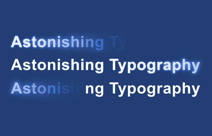
Output of the above code
Conclusion
Hoping that with this guide, you will be able to create exquisite typography effects on your web pages and make them appear stunning and more appealing than ever. As the above tutorial focuses on two approaches, you may choose to use a preferred one that best suits your project’s needs.
Author Signature
Rick Brown is a veteran iOS developer with Mobiers Ltd., where you can hire iOS app developer. You can get his assistance, to explore more about iOS app development services and its leverages.
This blog post was written by a guest author/contributor. If you would like to write or submit a guest post for citec.in/blog, please write us at info[at]citec.in