5 Reasons Why Selection of App Typography is Important to Its UI/UX
Tracking back the typography history, it can be seen that in 2013, Apple polished the system fonts in iOS7. This brought the print typography into the digital world. And in the recent past, it is evident how Android Lolipop also reworked on their Roboto fonts.
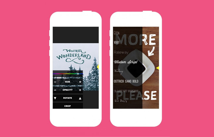
Mobile app typography is one such design element which is often overlooked by the app designers. But, what follows after that ignorance is nothing but a blunder. Because, typography and good design dwells on the same road, and therefore, it is really important to utilize in-app typography effectively.
If you look at how users are engaged in the mobile app, then it must be clear that they browse through what they read. So, when we talk about the visual representation of a communication language in mobile apps, we are certainly talking about UI-driven typography and not just typefaces.
And, for all these global digital changes in typography, there are reasons. And today we shall discuss 5 such reasons which highlight the importance of typography when it comes to enhancing UX/UI in mobile app development.
Typography Complements the App Design
The role of typography is not just to surface around in the mobile app, but to visually complement the overall app design. This will enhance the overall user experience, and in turn increase the user’s stickiness within the app.
A good design with bad typography is nothing but a sheer waste of an opportunity. Therefore, during the design phase, it is necessary to know which type of fonts will work, and if needed, a unique typography must also be created so as to make it work with the design. Integrating unique font styles yields remarkable exclusivity to the app design and thereby lifts up the entire app value.
Does Not Only Communicates, But Speaks To Users
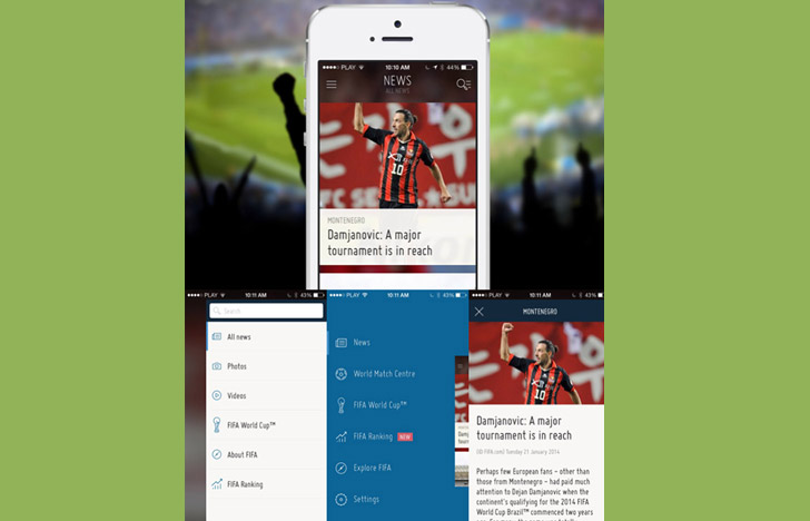
Not only does typography works as a graphic collaborator, but it also has significance in human psychology. With right choice of typography it becomes easy to connect with the app users as it allows overall app usability to function in the way it is meant to.
Typography is also closely related with the user’s mood. The pivotal role for typography over here is to engage users as if the app is talking to them simply with the written words. A good typography always invokes positive emotions on the people and thereby inflates the rate of responsiveness.
Typography Aids Visual Hierarchy
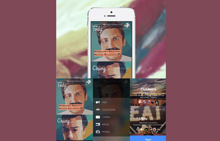
With great design it is possible to catch hold of user’s attention. But, when it comes to holding that attraction for longer, selection of typography plays a major role. This is because the typography creates a visual hierarchy which in turn, guides the user’s attention.
It becomes easy for the app users to follow the symmetrical flow of information and over visual arrangement in terms of colors, font-face, size, style, and alignment. It is only through typography users perceive information.
A Good Typography Communicates Message With Clarity
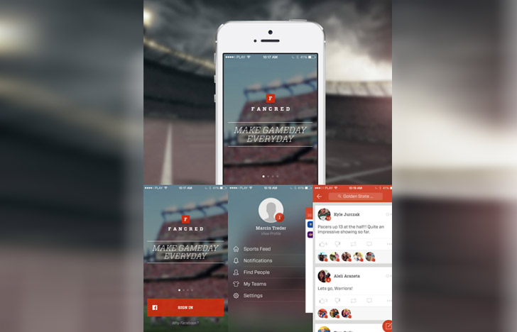
It is important for typography to work well with the design to win the trustworthiness and credibility of users. It is possible to highlight the important details with typography so as to drive user action through words. There are always chances of users returning to the app with excitement.
Typography is one such imperative design element which ensures emphasize on words so as to effectively communicate things to the users. Often, what enhances the choice of typography is the design surroundings which harmonizes the entire app experience.
One Poor Choice can Cause Great Trouble for App
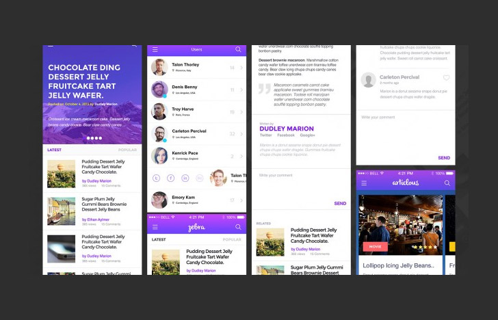
Mobile app not only solves the utility purpose, but it also aids in building a brand. One wrong move in the selection of typography can cause serious damage to the brand image. Indecorous spacing, sparse alignments, and inconsistency in the choice of fonts can lead to brand degradation.
An ideal mobile application is actually the amalgamation of utility, design, usability, speed, and texts. True, users perceive a mobile app as a whole package and not only the typefaces. But, when typography is not in alliance with the overall design, it can make design appear really murky.
Perhaps, this is NOT how your app should look like.
Conclusion:
Typography has a salient strength to induce users. It can result in a frequent use of an app and also smoothens the user’s navigation. Therefore, it is safe to say that selection of typography is really essential to the success or failure of the mobile app. A wise designer will always put more emphasis on the typography as a part of a visual element than other design elements.
Author Bio:
Shahid Abbasi is a marketing consultant with Peerbits. The company is one of the top mobile app developer. Shahid likes to keep busy with his team, and to provide top-notch mobility solutions for enterprises and startups.
This blog post was written by a guest author/contributor. If you would like to write or submit a guest post for citec.in/blog, please write us at info[at]citec.in


