10 Stunning Designs Of Beautiful Website Navigation
Websites, these days, are taking their navigation design to the next level simply because they want to make the act of “exploring†them as effortless as possible.
A thoughtful navigation acts as a road map for visitors to check out a website in a meaningful way. It delivers a visual impact while letting users know about the existence of the information they have been searching for. An intuitive navigation is correlated with increased conversions and is less likely to put people off. It also contributes to the user experience and take you one step closer to your visitors heart.
Over the past few years, a consumer appetite for mobile web usage has increased to such an extent that it has become almost impossible for web or mobile app developers to ignore its presence. They are stepping up their game when it comes to designing UI and overall navigation of their website to meet the growing demands of multiple devices.
Nowadays, you can see a number of websites built using creative and unique navigation designs. But how many of them have actually step up their game to provide audience a “wow†experience? Today, we will examine some websites lauded for their best of breed navigation designs. We have listed them below and the majority of them involves cutting-edge designing techniques that will surely give you some idea on how to plan your next designing project.
1. Jova
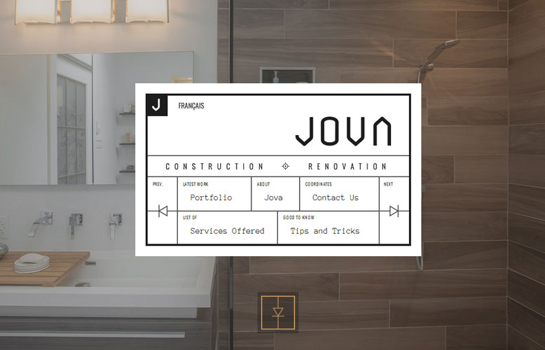
Jova is a beautiful website that is fashioned with a very clean and intuitive navigation.
The website is further enhanced using grid layout, black and white color scheme, and striking typography that together add to its appeal. Its stylish geometry note, complemented with a light colored backdrop further completes the look.

2. First Person
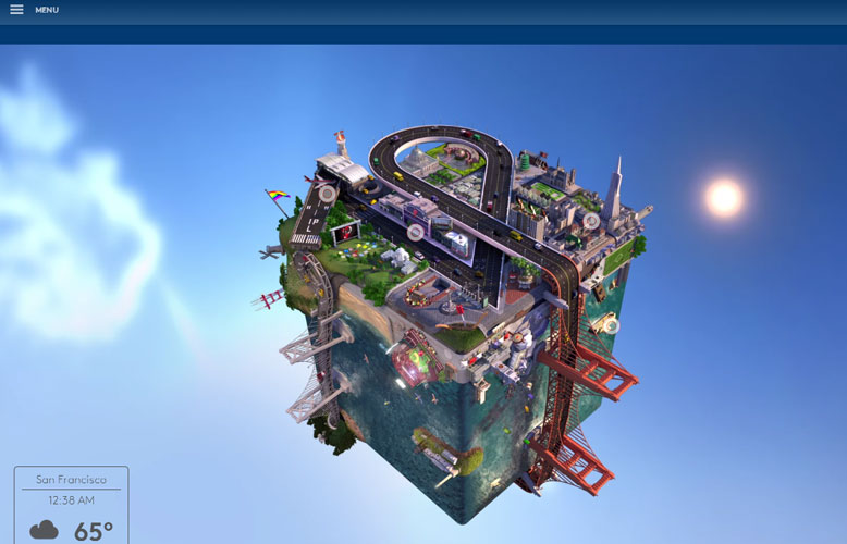
First Person is a website that enchants its viewers for its innovative appeal that is evident in the form of its cubic scene. Plus,the object is designed using two variations: Day and Night. Of course, they aren’t the main navigation, but elements that together catch the fancy of its visitors. The main idea is to produce dynamic effects that take the visitors into it and let them explore its corners.
3. My Own Bike
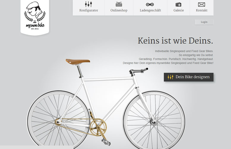
What makes the navigation of this website stand out is its subtle use of comprehensive icons that inform visitors about the information they can find in a specific page.
4. Pete Nottage
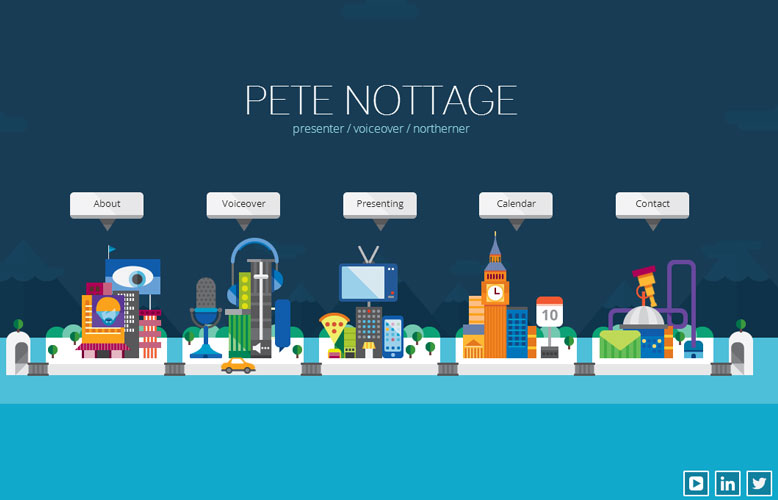
The online portfolio of Pete Nottage is an epitome of beauty and creativity. The website has made its navigation stand out by by composing different elements representing what the company actually does. The addition of moving cars and yachts together fill the design with full of positivity, and providing users an ability to move the elements from their position with just a single click is amazingly beautiful.
5. Bluegg
This is another fine example of website navigation. The official website of Bluegg.co.uk features a very simple and clean navigation which looks consistent across all its pages. The color indicator is the only thing that serves as a discriminator, which tells the visitor about the page they are surfing at present.

6. Moira Young
Moira Young’s official website isn’t just spectacular, but it has all the elements that keep visitors glued to it. Its well refined landing page with a touch of nature radiates brilliance. The navigation is quite unique as each link is hidden inside the illuminating dots placed near the tree.

7. Dataveyes
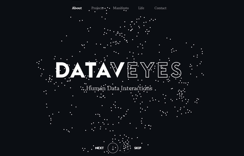
One the website loads completely, the Dataveyes navigation becomes visible beautiful in the center of its header, but one opting for the mobile view the navigation shrinks to make it easy for the visitor to find the information they have been searching for without hurting the content.
8. Austin Eastciders
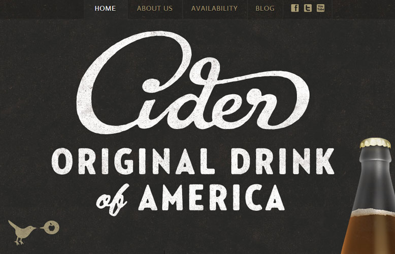
We really love the idea of navigation that Austin Eastciders’ website has put into shape. The website is built using two different but complimentary color backgrounds to let the user know about their exact location. This indicator is also a beautiful twist in the navigation designs we have been noticing for years. By creating different navigation background not only gives the user an idea about the information on the site, but also gives them an impression of the in-depth nature of menu items.
9. You Know Who Design
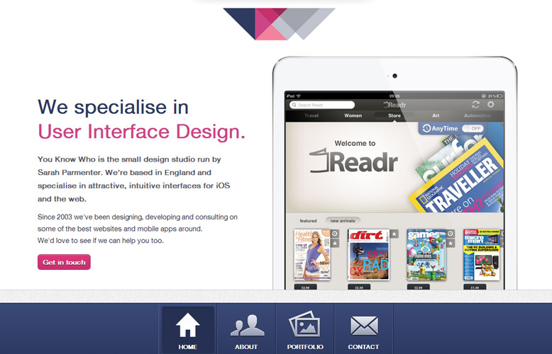
The official site of You Know Who Design is a great example of an intuitive navigation design. Its main navigation includes some user-friendly captions that inform visitors about the subpages that the main navigation is connected with.
10. Big Spaceship
The official website of Big Spaceship has pushed the envelope by designing a highly creative and innovative navigation. It uses a very unique approach by offering a left sidebar navigation that expands from a menu icon, something that is highly evident on mobile-ready websites. One can easily locate its navigation in the upper left corner of the landing page showcasing two different colors of paint splashing against each other, complimenting the black background.

That’s all, folks!
With this, here is the end of our round up of some truly beguiling, unique, and innovative navigation website designs that make sure you aren’t lost. I hope you like them and take some inspiration for your next project.
Author Signature
Addison Cohen is a mobile app developer working with Appsted Ltd, which is the leading mobile application development company and delivers the most comprehensive mobile application solutions. He loves sharing latest information on mobile technologies like iOS, Android development processes.
This blog post was written by a guest author/contributor. If you would like to write or submit a guest post for citec.in/blog, please write us at info[at]citec.in


