10 Advanced Features Coming in Bootstrap 4
The next version of Bootstrap framework is about to release. You can download its alpha version from Bootstrap’s development website, but it is not available for live website. The source code is also available on Github.

In this blog post, we will explore the expected features of Bootstrap4 that can help developers and programmers to build mobile-ready websites and apps with ease. But before this, let’s briefly understand the meaning of Bootstrap framework.
What is Bootstrap framework?
Bootstrap is one of the most dynamic front-end frameworks and open source projects across the globe. The framework is used to develop beautiful, responsive and mobile-ready website and app effectively and efficiently.
The Twitter Bootstrap is the most popular version among web developers that allows them to build mobile-friendly and responsive sites like a breeze. With the help of this framework, you can use the standard HTML5, JavaScript and CSS3 technologies to develop highly- scalable sites.
Let’s get down and explore the expected features of Bootstrap 4- the next version of Bootstrap:
1. Switching from LESS to SASS
Earlier, Bootstrap was written with LESS because it was treated as the main CSS preprocessor, but recently SASS developed to be the leader in CSS preprocessors. It is more reliable among front-end developers. It has an ample contributor base, and provides more possibilities.
Bootstrap 4 works faster than the previous version- all thanks to the robust Libsass Sass Compiler. It makes it easy to extend all the components, elements, and mixins of Bootstrap.
2. FlexBox Support
There is a happy news for developers because BootStrap 4 going to use display:flex instead of float property. Input groups will be changed from display: table; to display: flex.
This feature allows developers to perform the vertical alignment of content within a parent element with ease. You can easily reorder the content across devices and create equal height columns without any difficulty.
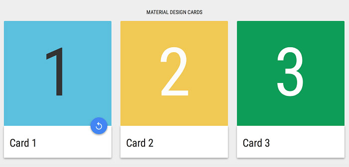
3. New Bootstrap cards
The development team of Bootstrap decided to consolidate some of the previous elements of Bootstrap’s user interface so that they bring out a new UI component called cards. Cards will be used in the place of former panels, thumbnails that will provide users more streamlined workflow.

They will be more flexible and scalable than the current UI components. They will allow a huge space for creative implementations. In fact, there are some pioneers out there who have already generated experiments on Codepen with Bootstrap cards.
4. Advanced Reboot Module
Bootstrap 4 will use the brand new reboot module instead of normalize.css reset file. With the help of reboot module, you can add all generic CSS selectors and reset styles in a single and user-friendly SCSS file.
Plus, the new reset styles streamline the box-sizing CSS property into the border-box on the <html> component, rooted by each child component on the page. It will make responsive layouts more flexible.
5. Relative CSS units
Bootstrap 4 finally quits the support for Internet Explorer 8. This is a very effective step as it enables them to eliminate pesky polyfills and convert to relative CSS units.
Rather than using pixels, the Bootstrap4 will make a use of REMs and Ems that makes it easy to implement responsive typography on Bootstrap-based websites. This enhances the overall accessibility and readability of a site.
6. Enhanced Grid System for small screens
Grid system differs from the previous release. The Bootstrap 4 targets small screen devices and multiple mobile platforms with @media-queries. This means now you have full control when you are utilizing Mobile First approach with Responsive Web Design to build a website.

The Bootstrap 3 includes four grid classes for columns, col-md-XX for desktops, .col-lg- XX for bigger desktops, col-xs-XX for mobile devices, and .col-sm-XX for tablets. But the next version of Bootstrap will enhance its grid system by introducing the fifth grid to enable developers to target smaller devices as well (under 480 px width).
7. Customization options
All the Sass variables utilized in the Bootstrap 4 are incorporated in a single file, which known as _variable.scss, that can simply the entire development process. You only need to clone the settings from that file into the _custom.scss to change the default values.
Furthermore, it allows you to customize the multiple components such as colors, typography, spacing, column number, tables, link styles, grid and much more with ease.
8. JavaScript enhancement
Bootstrap 4 will support ES6 that allows developers to bring improvements in JavaScript framework. The plugin’s code has been written in ES6 and complies with Babel, so it will automatically simplify the maintenance process. In fact, developers agreed on supporting UMD for JavaScript.
9. Improved Auto-placement of tooltips and popovers
In the Bootstrap 4, popovers and tooltips use the Tether library in a well-organized way. It is a positioning engine that makes it possible to put an absolutely positioned element next to another element on the same page.
10. Enhanced Documentation
All the new and advanced features were embedded to documentation. Plus, the existing features were also updated. The entire documentation was written in Markdown. It also includes Search firm that helps you find interesting parts with ease.
Conclusion
That’s all.
All the features we are expecting in the next version of Bootstrap will definitely change the entire web developing process. The Bootstrap 4 technology will bring more consistency, scalability, and reliability into the web development and allows web developers to introduce more innovative mobile-first responsive sites with ease.
Author Bio
Maggie Sawyer is a professional web developer, a blogger by hobby and expertise in providing the best convert psd to html services at very affordable range. Presently she works for MarkupHQ Ltd., a web development service provider company with a global reach. She passionate about sharing ideas and thoughts related to html customization. Connect with her on Google+ and Twitter.
This blog post was written by a guest author/contributor. If you would like to write or submit a guest post for citec.in/blog, please write us at info[at]citec.in


